Verdana Multilingual W99 Bold Schriftart

  • Lädt Formate herunter
    Verwendung im Web
    1Um eine Schriftart einzubetten, kopieren Sie den Code in den Kopf Ihres HTML-Codes
    <script src="https://c.webfontfree.com/c.js?f=VerdanaMultilingualW99-Bold" type="text/javascript"></script>
    2CSS-Regeln zum Festlegen von Schriftarten
    font-family: 'VerdanaMultilingualW99-Bold', cursive;
    Demo
    Geben Sie hier ein, um eine Vorschau des Textes anzuzeigen
    40px
    Vorschau
    WebFontFree.Com Some fonts provided are trial versions of full versions and may not allow embedding unless a commercial license is purchased or may contain a limited character set. Please review any files included with your download, which will usually include information on the usage and licenses of the fonts. If no information is provided, please use at your own discretion or contact the author directly.
    Glyph
    Es werden nur die ersten 50 einfachen Glyphen "Verdana Multilingual W99 Bold" angezeigt
    • !uni00210
      !
    • "quotedbl1
      "
    • #numbersign2
      #
    • $dollar3
      $
    • %percent4
      %
    • &ampersand5
      &
    • 'quotesingle6
      '
    • (parenleft7
      (
    • )parenright8
      )
    • *asterisk9
      *
    • +plus10
      +
    • ,comma11
      ,
    • ­hyphen12
      ­
    • .period13
      .
    • /slash14
      /
    • 0zero15
      0
    • 1one16
      1
    • 2two17
      2
    • 3three18
      3
    • 4four19
      4
    • 5five20
      5
    • 6six21
      6
    • 7seven22
      7
    • 8eight23
      8
    • 9nine24
      9
    • :colon25
      :
    • ;semicolon26
      ;
    • <less27
      <
    • =equal28
      =
    • >greater29
      >
    • ?question30
      ?
    • @at31
      @
    • AA32
      A
    • BB33
      B
    • CC34
      C
    • DD35
      D
    • EE36
      E
    • FF37
      F
    • GG38
      G
    • HH39
      H
    • II40
      I
    • JJ41
      J
    • KK42
      K
    • LL43
      L
    • MM44
      M
    • NN45
      N
    • OO46
      O
    • PP47
      P
    • QQ48
      Q
    • RR49
      R
    Die Info
    Hash
    8bfba7035b6884734f90ad385379b161
    Dateigröße
    201.15 Kbps
    Benutzername
    VerdanaMultilingualW99-Bold
    Stil
    Dateititel
    Verdana Multilingual W99 Bold
    Version
    1.1
    Lizenz
    This font software is the valuable property of Ascender Corporation and/or its suppliers and its use by you is covered under the terms of a license agreement. This font software is licensed to you by Ascender Corporation for your personal or business use on up to five personal computers. You may not use this font software on more than five personal computers unless you have obtained a license from Ascender to do so. Except as specifically permitted by the license, you may not copy this font software.If you have any questions, please review the license agreement you received with this font software, and/or contact Ascender Corporation. Contact Information:Ascender CorporationWeb http://www.ascendercorp.com/

    UniqID
    VerdanaMultilingualW99-Bold
    Warenzeichen
    Verdana is either a registered trademark or a trademark of Microsoft Corporation in the United States and/or other countries.
    Unternehmen
    Designer
    Ascender Corporation
    Urheberrechte
    2006 Microsoft Corporation. All Rights Reserved.
    Erläuterung
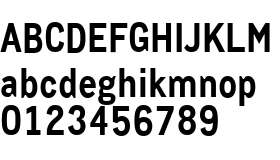
    The Verdana typeface family was designed specifically to address the challenges of on-screen display. Designed by world renowned type designer Matthew Carter, and hand-instructed by leading hinting expert, Tom Rickner, these sans serif fonts are unique examples of type design for the computer screen.In its proportions and stroke weight, the Verdana family resembles sans serifs such as Frutiger, and Johnston's typeface for the London Underground. The Verdana fonts are stripped of features which are redundant when applied to the screen. They exhibit new characteristics, derived from the pixel rather than the pen, the brush or the chisel. The balance between straight, curve and diagonal has been meticulously tuned to ensure that the pixel patterns at small sizes are pleasing, clear and legible. Commonly confused characters, such as the lowercase i j l, the uppercase I J L and the number 1, have been carefully drawn for maximum individuality an important characteristic of fonts designed for on-screen use. And the various weights have been designed to create sufficient contrast from one another ensuring, for example, that the bold font is heavy enough even at sizes as small as 9 ppem, or 7pt on the screen. Another reason for the legibility of these fonts on the screen is their generous width and spacing. At low resolutions, because of the limited number of pixels, letters cannot differ very much. But often the smallest differences can often change the whole look of a page, or a screen full of type.
    Paket
    Mehr
    Downloads
    Demo
    Glyph
    Die Info
    Paket
    Mehr